Results and conclusions
Q1. Are you male or female?
Male- ||| = 3
Female- ||||||| = 7
Conclusions: My results are biased because I have asked more females than males. I need to take this into account when making decisions about my magazine.
Q2. How old are you?
Under 10- | = 1
11-16- |||||| =6
17-30- || = 2
31+- | =1
Conclusion: I asked more 11 to 16 year olds to answer my questionnaire. As I haven’t got as many under 10 or 31+ aged opinions I will be basing it more around the 11-16 year olds as I have more information from them. I will take some of the opinions from the 17-30 year olds aswell.
Q3. What is your favourite colour?
Yellow- | = 1
Pink- ||| = 3
Blue- || = 2
Green- | = 1
Purple- || = 2
Orange- | = 1
Conclusion: As more of the target audience said there favourite colour was pink I will make most of the magazine that colour. It was quite unfair as I asked more females than males and they have different types of views. I took one of the 2nd choice colours too so that it gave different colours for others.
Q4. How often do you buy a magazine?
Daily- O
Weekly- || = 2
Fortnight- |||||| = 6
Monthly- || = 2
Conclusion: Since more teenagers said that they buy their magazines every fortnight im going to have a new issue every fortnight because hardly anyone will be it each day and not many people bought it weekly.
Q5. Do you prefer bands or solo artists?
Solo artists- |||||| = 6
Bands- |||| = 4
Conclusion: As more of the target audience said they like solo artists more than bands I am going to add more solo artists into the magazine and the main image will be a solo artist.
Q6. What do you think of with the word “POP”?
Glitter x 1
Pink x 3
Singers x 4
Make up x 1
Girls x 1
Music x 7
Celebrities x 6
Boys x 1
IPod x 2
Microphone x 1
Music channels x 3
Conclusion: All of these words will be put into account and put in the magazine as they will show what genre of music the magazine is so that people know and buy the magazine. They are also kind of hints of what there is in magazines.
Q7. Do you go on the website?
Yes- ||||||| = 7
No- ||| = 3
Conclusion: Most people go onto the website so I will put a website on the magazine to show that the music magazine has a website that they can access.
Q8. What is your favourite genre of music?
Pop- |||||| = 6
Indie- | = 1
Rock- || = 2
Classical- 0
Other-0
Conclusion: Over half of the audience answered that they enjoy pop music more than the others. No one thought that classical was there favourite so that wont be included. It will be a pop music for definite now.
Q9. If other what?
There was no result for other
Conclusion: No one had any other choices for their favourite genre of music.
Q10. Do you buy the magazine for the free gifts?
Yes- ||| = 3
No- ||| = 3
Sometimes- |||| = 4
Conclusion: More of them said that they only buy the magazine sometimes because of the free gift inside whilst about a quarter shed they do and the other quarter said that they didn’t. I am going to put a free gift inside and make it something that really interests teenagers because they may only buy it sometimes depending on what it is.
Q11. What do you like as a free gift?
Make up- ||| = 3
Creative- | = 1
Clothes and accessories- ||| = 3
Other- ||| = 3
Conclusion: More people liked the clothes and accessories and make up of the free gifts more than the creative. Some people had some more opinions on the best gifts. All the free gifts will be taken into account. I will ask more people on audio and video clip them to see what they thought of either make up, clothes and accessories and the other 3 choices.
Q12. Other?
Music merchandise x 1
Posters x 1
Stationary x 1
Conclusion: These were the 3 other choices. These will be asked by the public on there favourite.
Q13. Who is your favourite artist or band?
Taylor Swift x 2
Zac Efron x 3
Jonas brothers
Cheryl Cole
Lloyd Daniels
Michael Buble
Kings of Leon
Conclusion: The most favourite celebrity of the target audience was Zac Efron. I will use him on my magazine as he is the most loved and people are more likely to buy it. The second favourite was Taylor Swift so she will also be mentioned.
Q14. What gender would you prefer on the front of your magazine?
Same sex- |||| = 4
Opposite sex- |||||| = 6
Conclusion: More people preferred the opposite sex on the front cover. I think that its important for a girl to have someone they can look up to that’s why I am going to put a female as the front cover image and the results didn’t have a big difference to them. I asked people why they chose their answers.
Q15. How much would you charge for a magazine?
Up to £1- || = 2
£1.01-£2.00- || = 2
£2.01-£2.50- |||||| = 6
£2.51+- 0
Conclusion: £2.01 to £2.50 was the most someone would pay for a magazine. I think this is because most magazines are based around that price. I am going to charge around £2.10 for my magazine as it’s in the best chose range.
Q16. What do you like in magazines?
Celebrity gossip x 4
Reviews x 1
Free gifts x 2
Horoscopes x 2
Celebrity interviews x 1
Conclusion: More people enjoy the celebrity gossip in music magazines. I will involve more of this in the magazine so that the readers see it and want to read it. I will add a free gift aswell because it was one of the second choices that people enjoy of the magazine.
Q17. What don’t you like in magazines?
Nothing x 3
Don’t know many of the bands or artists x 4
Not all the information you want to know is inside x 3
Conclusion: People agreed that that they don’t know many bands or artists that are in the magazine. The other problem was that they don’t have all of the information that they want to know inside. To stop this I am going to video record people asking them what they would like to know.
These are my results to my questionnaire and the conclusions that i will be including with the pie charts. This helped me to create the pie charts and the conclusions will be helpful to know what and what not to include in my magazine and explains the results properly.
Friday 30 October 2009
Thursday 29 October 2009
Task seven ( music )
Questionnaire
1. Are you male or female?
2. How old are you?
3. What is your favourite colour?
4. How often do you buy magazines?
5. What would you prefer…? Band or solo
6. What do you think of with the word “POP”?
7. Do you go on the website?
8. What is your favourite genre of music?
9. If other what?
10. Do you buy the magazine for the free gifts?
11. What do you like as a free gift?
12. Other?
13. Who is your favourite artist or band?
14. What gender would you prefer on your front cover?
15. How much would you charge for a magazine?
16. What do you like in magazines?
17. What don’t you like in magazines?
These are the questions that i put in my questionnaire.
I printed and gave out 20 copies of my questionnaire. I asked a different range of people so that i could get different results and compare them. I chose these questions because i thought that they really helped to get what the target audience like out of magazines and in general.
This is a one of my questionnaires:


I asked some questions to people around and video recorded them so that i could get better reasons for answers. I asked people i hadnt already given a questionnaire too and asked people with different age ranges to get different opinions. These are the recordings:
Question 13:
Question 3:
Sarah's questionnaire
Wednesday 28 October 2009
Task six ( music )
For task six i had to analyse a double page spreads of magazines that are already out there and note all the codes and convections. I looked at the magazine Kerrang. I noted all the things that they have in common and all the different names for all the details on the magazine. These was abit different than task four and five as they dont have the same qualities or features. They also had different settings and layouts. The analysed picture is from my magazine that i scanned. It is different from the other double page spreads as it was mostly a picture and abit of writing and story. This is my work for it:
This is the pages of the magazine:


This is it analysed:

Codes and convections:
o They have quotes from the article-grabs the readers attention
o Beginning of article-Introduction
o First letter of the article-Big and coloured
o Big image
o Limited use of colour-only use a few colours e.g black and white
o Headlines-eye catching
o Names of artists are bold and stand out
o Picture and name of journalist-mentioned for their work
o Byline to seperate-text-columns
o Page number in corner
o Title of the article and magazine-Bold, big and stand out
o Background picture or colour
o Little images around the page
o Articles artists website
Tuesday 27 October 2009
Task five ( music )
For task five i had to analyse the contents pages of magazines that are already out there and note all the codes and convections. I looked at the magazines Q and Kerrang. I noted all the things that they have in common and all the different names for all the details on the magazine. I noted what everything was and why they were layout in that way. This is my work for it:

Codes and convections of a contents page
o It is set out in columns ( usually 3 )
o Images to go with the coverlines
o Different colours
o Bright colours
o Photograper's name for the image
o Different categories
o Word contents at the top
o Editors letter
o Text is size 11pt
o Background colour
o Line or something seperates the columns
o Details to email or write to
o Page number with the images
o Page numbers at the bottom
o Some have a main image
o Different colour for the different categories
o Colour co-ordinated
o Website
o Picture dominates it
o Contact details
o Bright colours
o Have title of magazine on
Codes and convections of the POP genre
o Bright colours
o Not slang writing
o Simple music images
o Big writing
o No big words
o Not alot of writing
o The latest, famous celebrities
Monday 26 October 2009
Task four ( music )
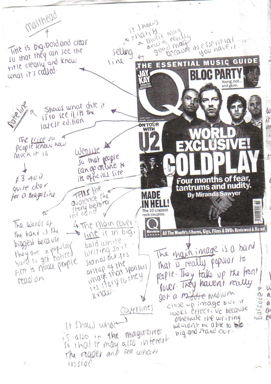
For task four i had to analyse front covers of magazines that are already out there and note all the codes and convections. I looked at the magazines Q and Kerrang. I noted all the things that they have in common and all the different names for all the details on the magazine. This is my work for it:


Codes and convections:
o Puff- try to impress the readers to buy it
o Barcode- on the front cover because there are normally adverts on the back cover
o Main image- needs to be big so that the readers know what the magazine has inside and get attracted to the celebrity to read on. The artists also need to have eye contact so looking at the reader. The main image shouldnt be ontop of the title because you wont know what the magazine is called.
o Buzzword- gives the reader a idea what the magazine is going to be about
o Price- under the title. See how much it is
o Dateline- under the title. Shows its latest issue
o Issue number- on the side of barcode
o Anchoring images- the images that attract the readers to the magazine
o Masthead-- this is the title and should be big, bold and stand out.
o Selling line- makes people want to buy the magazine
o Main coverline- gives the reader the chance to see whats in the magazine and whats interesting the world.
o Coverlines- tells the reader whats inside
o Free gifts- another feature that makes the reader more interested into buying the magazine
o Simple colour scheme- same colours based around the magazine
o Tagline
o Website-readers can go online to find out more information
o Subscription- readers can subscribe and get more issues
Sunday 25 October 2009
Task three ( music )
This are the details about my own music magazine that i will be creating.
Price of magazine is £3.10
I chose £3.10 because it is around the middle of the other magazines price.
Frequency of publication is Every fortnight
I said every fortnight because it shows that the information is new and updated every fourteen days.
Average issue size is 99 pages
I chose 99 pages because it gives alot of pages for the amount of money and is around the same amount as the other two magazines.
Regular content is
o Games
o Horoscopes
o Posters
o Cringes
o Song lyrics
o Local concerts
o Rating!
o Quizzes
o Before celebrity times
o Your opinion
o Advice
o Win!
o Top 10
o Popland voting station!
o New out!
Feature articles are
o Clubland goes live !
o Win! The saturdays signed CD
o Taylor Swift spills the stories behind her songs
o Michael Buble albulm review
o Interview with Lloyd daniels
o Kings of leons break up?
o Jonas brothers inside gossip on tour
o Whose to win x-factor
o Could you win the x-factor?
o High school musical live DVD review
o Zac Efron to marry Vanessa?
o Cheryl coles solo career
o Miley Cyrus new clothing line
I chose these feature articles as in my target audience research questionnaires these were my audiences favourite celebrities. This means there is more chance they will buy it to read about their favourite celebrity.
Saturday 24 October 2009
Task one and two ( music )
Main task
Task one
The type of music magazine I am doing about is the pop genre
My target audience is for teenagers around the age of 13-18 for both genders as they are more likely to read a pop magazine because it is about all their favourite celebrities and activities that they like to get up too.
Task two
J-14 magazine
The J-14 magazine is £3.99
The J-14 magazine is published every fortnight
The J-14 magazine issue size is 111 pages
The J-14 magazine regular content is
o Fun & Games
o This or that?
o Horoscopes
o Posters
o Song lyrics
o Win it!
o Say what?!
o Who wore it better?
o True or false?
o Kissed, dissed or doesnt exist?
o Hot? or help!
o Totally embarrasing moments
o J-14 poll
o Beauty tips
o Calander
o You asked
o Before they were stars
o Tales of truth or dare
o Interviewed by you!
o Quizzes
The J-14 has feature articles such as
1. "Is Nick over miley?"
2. "What's tearing Zanessa apart?"
3. "Kissed or dissed?"
4. "Selena's kissing confession"
5. "New couple alert!"
6. "Guess who Jason's dating!"
7. "Joe's love triangle"
8. "Is Miley crushing on another JoBro?"
9. "Ashlee sishes about Pete"
10. "Miranda's kid's choice dress"
11. "Cody's crush laughed at him!"
12. "The unlucky Jonas brothers"
13. "Ashlee's image makeover"
14. "Guys confess"

Top of the pops magazine
The top of the pops magazine is £2.20
The top of the pops magazine is published monthly
The top of the pops magazine issues size is 88 pages
The top of the pops magazine regular content is
o Beauty advice
o Celebrity Oooops!
o Your Ooops!
o No boys allowed
o Posters
o Win!
o Puzzles and prizes
o A-list
o Fashion tips
o Review on a tv program
o The stylish clothes
o Sam and Marks therapy
o Your mystic month
o Your letters with JK and Joel
o In next magazine
o Celebrity snap
o Sing along
The tops of the pops magazine has feature articles such as
1. "Star surgery shocker!"
2. "Zac needs you!"
3. "34 celeb 'it' items"
4. "Mates special"
5. "Who's Danny McFly's new girl?"
6. "My abuse hell"
7. "Pregnant and scared"
8. "Beaten and abused...but i still have hope"
9. "My dog had 18 puppies!"
10. "Forever friends"
11. "Concerts"
12. "Interview with Kelly Rowland"

Friday 23 October 2009
Task nine ( school )
Task nine is my evaluation. My evaluation is going to be about what, why and how i created my front cover and contents page. I will be comparing it to other magazines that are actually out there and sold worldwide.
Whilst i was creating my front cover and contents page i came across some quite major and minor problems whilst creating my coursework. The major problem was that the school network had gone down for a few weeks after completing my project. When all of my documents returned some of the pieces of work had been removed and deleted from all subjects. I had two weeks to redo it again. This made it complicated as it took me a while to create the first copy to make it look good and i now had 2 weeks to complete both and upload my blog. For our contents page we started to use another program to create it which is called Quark Express. We had never used it before so we didnt know what to do. On our first lesson Camilla the media helper came in and shown the class how to use it. This was really helpful and helped me alot as i took notes to go back to.
My media magazine does use forms and conventions of magazines that are already out there being sold. In ways like they use a clear, fancy font so i have used a font that is clear, fancy, big and bold. Both magazines are similar by the way the magazine has been set out as its got all the same type of features around the same place. Professional magazines have a certain theme like colour so I have tried to the same with mine. I have used the Weatherhead colour on my magazine to show that it is actually a Weatherhead school magazine and to make it look effective. The main images on the front covers are normally medium close up shots though some can be a full body close up I decided on mine being a medium close up shots because it shows the important part of the image which is the student wearing the Halloween hat as it shows the story of this weeks magazine. I have also made sure that the student is having eye contact with the reader and that the image isnt ontop of the title of the magazine. I have gave the magazine two selling lines ("Free" and "Win!") so that they attract the readers into getting the magazine. Also anchoring images have been included. I have made the main coverline big because the reader will want to more about whats going on and see that first. There is a simple colour scheme throught the whole magazine. High School gossip has a published editor letter which most magazines have and a background behind most images.
My magazine is quite challenging as there is no background behind the coverlines so they dont stand out as much and there is too much wasted space around it which just looks plain as there was nothing to go there whereas local magazines make sure that every space is filled up so that the magazine doesnt look empty. On my magazine the colours are quite dull and plain as only a few colours have been used. They should be bright, effective and attractive colours so that they stand out. Normally the issue number and barcode are really small and hidden in a corner of a magazine but mine is rather big and looks quite wierd as it stands out and its not important to the magazine or attractive. I havent created the text for the coverlines or masthead in a bold and creative font or size. Most of the speech, star or circle designs are usually filled in with colour but mine are see-through and can see the main image. My editor is far too big than what is shown in published magazines and should be a smaller size to decrease the amount of space it took and have a image with it either the editor or front cover of the magazine. On the contents page the images are usually labelled with a page number to show the readers quickly where to go but i couldnt find room for them unless ontop of the image.
To create my preliminary project I used two different programs, Adobe photoshop and Quark Express. I had to use Adobe photoshop to create my front cover. I have used this program for about 5 years throughout Weatherhead so knew what to do and how to do it. This made it easier for me to carry on with my work quickly. I knew all the buttons that were needed. It had been a while since I had used it when we first started so I needed some help on how to do a few stuff but after a while I remembered again and carried on. Photoshop is the program to use when you need to edit images. For most of my images I needed just the image itself and none of its background so I used the zoom in tool and rubbed around the edges to clear the background ready for my magazine. I would have to then save the manipulated image and add it to my front cover or contents page. When I needed the background I used the tool which gets the entire one colour together so that you can just colour it in with the colour you want instead of going on top of the image. I coloured the background in black to make the image stand out. Quark Express is the other program that I used for my contents page. Quark was new to me as I had never used it before so I didn’t fully understand how to use it. When the teacher came in and explained it took me a few weeks to understand it properly. I started to try different buttons and ways in doing stuff and finally got used to it. It took me a lot longer to create my front cover and I felt as if there was more you can do on Photoshop that will make it look more professional and attracting. I also had to use Microsoft word to make a star shaped for the WIN! part of the magazine. I then copied and pasted it on to Photoshop and rubbed out the middle section.
My strengths of the magazine were probably that I learnt Quark express quite easily so I had more time to carry on with the other sections of the magazine. Overall both of the programs were rather easy to use. My magazine had a theme to it which was the Halloween theme as some of the text was orange and black and the student had a Halloween hat on. The other theme was the colour scheme that was based on Weatherhead’s school colour which was then made the background colour for the front cover and contents page. The main image was a good, clear quality and showed the student really detailed. None of the image had been cut into and was cut around quite well. The two selling lines “Free” and “Win!” are rather big so that they stand out and people are more likely to want it and buy it. The images around the edge will show its not just a magazine of writing and shows some fun and attractiveness to the magazine. The whole magazine is colour co-ordinated with the background and text. The names of the coverlines are quite catchy and give you quite an understanding of what the story is going to be about so I think that they are quite creative. Underneath some of the coverlines are descriptions of what the magazine is going to about inside which I think Is a good idea because its persuading the reader to read on and find out more. The layout on the contents was okay as it was organised.
My weaknesses of the magazine are that I have got too much blank space around the edges where coverlines and images should be covering. I think my biggest weakness was when all my work had disappeared and I had to start again. As I was quite happy with my first piece of work I didn’t put as much effort into the second pieces as i had forgotten how to lay it out and what was where and that. It also decreased time for my main task. I think that the main coverline, little coverlines and the masthead’s font are quite boring so need more colour, bigger and bolder fonts. Some of the features that weren’t so important to the magazine were made bigger to increase space and don’t look as attractive on there. The image wasn’t taken very well and needs to be more of a medium close up shot to stand out more. It also has the outside tree in the spaces of the Halloween hat which needed to be rubbed out but were quite impossible as the gaps were too small. I needed to add numbers on to the images on the contents page so that it made it easier to get to the page needed but there wasn’t as much space as they’re was meant to. The editors letter took up a large amount of space as they’re was quite a lot to write about but I could have made it a smaller text. I think spreading the images around the page would have made it look more attractive instead of just one line of them. The black background doesn’t really stand out as I thought it would and doesn’t look very attractive. The sixth former shows that the picture wasn’t taken in Weatherhead as you can see the background and the television. I should of rubbed the background off but didn’t have as much time. I had quite a struggle on thinking of ideas on what to do so that took up a few lessons. On the front cover the layout was all over the place so need tidying up abit more. Overall I didn’t really follow the rules of codes and convections because my magazine was quite different to the average magazine.
Thursday 22 October 2009
Task eight ( school )
Task eight was to create my contents page by using a different program called Quark express. This was new to me as i had never used it before so Camilla came in and taught us how to use it by step by step. After about 2 weeks later i finished my contents page and it was complete. A week later the school network was down and most of my work from my documents were deleted including my front cover, contents page and some of my main task work. I had to start most of it all over again. I think that my first version was alot better as i had more time to do it and had help from the lessons whereas i did this in my own time. I didnt put the numbers on the pictures because they wouldnt stand out and would be squashed on the picture. All the writing is nearly the same except some of the editors letter where i decided to swap some words around.
This is my contents page.

This is my contents page.

Wednesday 21 October 2009
Task seven ( school )
For task seven i was to create a front cover page using Adobe Photoshop. I was to follow my front page sketch that i had created. I had to change some little details like where the barcode was placed and the title of the no bullying campaign. I changed them because i think that the barcode looked better in tha corner instead of all over the page. I also changed the title of the no bullying campaign because i thought Taking action! sounded better and more article based than Stop bullying! I didnt know what to have as the background colour so i chose a purpley colour as it is the Weatherhead theme colour. There was alot of space left around so i added writing in that showed that the magazine was free so that students would want to buy it more.
This is my magazine:

This is my magazine:

Tuesday 20 October 2009
Task six ( school )
Task six was to use photoshop. I had to upload my photos and then change them into how they will be on my magazine. On alot of the photos i cut around them so they had no background at all on the image. It took me a while because i had to do it carefully so that none of the picture was cut off. I zoomed in and out to make sure i could see what needed parts needed cutting. I used to tools to do this. One was a tool that when you clicked part of the photo it would highlight all the picture that had the same colour so you could delete it. This was abit difficult because some of the picture blended with the background so it would cut the picture aswell. In the end the parts that i werent able to do i got the rubber and cut around. I had to keep changing the size of the rubber depending on how big or close to the picture it was. I had quite abit of time to do this cause i have photoshop at home so i was able to finish it at home ready for the next lesson. Some of them i kept the white background on to be able to rub out easily on photoshop.
These are the pictures after i changed them:


After i edited the background i coloured around each picture in black so it would stand out and would show clearer on the magazine. I edited every photo except one which didnt have a background anyway so couldnt be edited.
These are the pictures after i added the new background:


Monday 19 October 2009
Task five ( school )
Task five was actually taking the photos needed for my whole magiazine. I was abit behind with my designs of the front cover and contents page as i changed my ideas quite a few times. So i didnt know what i needed and on the first week i wasnt able to get hold of a camera as theyre wasnt enough to go around. In my free lesson i went around the school taking some of the appropriate images that were needed for my school magazine. I took the photos from inside and outside. I only got the images that were needed for the contents page as I never had enough time to get the bigger images. I also hadn’t organised time to meet the student or had the right equipment that would be on my front cover. These were the images that were taken.


I am not going to be using all of these images because i dont think that they are right for my magazine. Some of the images i had to take a few shots so that i could get the right angle. I took a few images of the media awards because i wasnt sure if i would have the chance again to take them again. I had abit of help from Mr Fraiser that helped me to figure out what to take photos of.
/
I first heard Kraftwerk which is the name of a German band who are still touring today.
The next lesson i was able to get all the other photos that i needed for my contents and front cover though some had to be taken in my own time at home because i couldnt get hold of the students in school time.
Sunday 18 October 2009
Task four ( school )
For my forth task i was to draw the rough sketch of my contents page. This changed a few times as i had it as a two sided paged contents page. After a while i found it too hard to carry on so i decided to change it into a one sided page one. My final product ended up as three columns. The coverlines and editors letter in one column and then in the other pictures and a description of two of the stories to give the audience a chance to see what the magazine reports. Ive decided on the contents page being a purple colour as the schools colours are purple. The text writing is a simple, black, bold and clear font so that it is easy to read and understand.
This is my sketch:

This is my sketch:

Saturday 17 October 2009
Task three ( school )
This is a list of the regular content that will be in my magazine.
o School horoscopes
o Dear Folan
o Games
o Exam tips
o Win!
o Sports news
o Fun homework
o Get more iris points
o Stress tips
I put some of these into account but some of them i just couldnt use because they wouldnt fit onto the one sided page. I think that if i had more time i could of made my contents page double sided and fitted more of these on to it.
I then created a list of all my 10 feature articles that would be in my magazine. In the end i had around 15 feature articles but these were my first 10 i created.
o Horror "school" night (my main coverline)
o Ice radio goes live
o Stop no to bullying!
o Drama present beauty and the beast
o London
o Healthy eating
o Block D improvement
o Media wins award
o Artwork shows
I found this quite hard because i didnt know what to write and was finding it quite difficult to figure out what to include in my magazine. Whilst making the contents page i changed some of the ideas and part of the names.
Then i had to figure out what images i would need to take for the magazines contents page. This was quite easy because i just found the images that went with my coverlines.
Some of the images i took:
o Sixthformer with a non bullying poster
o Block D sign
o Media awards and equipment
o The fruit machine
o Art work display
This took me around three days to take them all.
Friday 16 October 2009
Task two ( school )
For task two i had to produce a rough sketch of my front cover including the title, issue date and price and the coverlines. This task was pretty hard because i was making it quite complicated and didnt know what to do on it. I wrote all the details down first on a piece of paper so i knew what to draw and write. I decided on the main image being a picture of a student in Weatherhead wearing a halloween witches hat because it shows that Weatherhead are celebrating the fact that it is halloween and getting the children involved. I also included some pictures that will help the target audience figure out what the magazine is going to be about. The price is going to be Free because they are being given to the students and some may not be able to afford it and it is only right that all the children are given the right to know whats happening in there school. Its issue date is October because that is the month of halloween. There are a few different coverlines because they show the different stories and events the school magazine reports.
This is the sketch.

This is the sketch.

Thursday 15 October 2009
Task one ( school )
Today i had to think of ideas on what to call my magazine. It had to be school based and have a catchy name that would capture the readers attention. I made a list of different names and then swapped some parts of the idea names to create better ones. It took me quite a while to figure out what to call my magazine because i didn't have any ideas at first. My first draft names included Weatherhead weekly, High school madness and School rumours. I didn't use one of these names because either other people were using them or they didn't really sound catchy. In the end i decided to call it High school gossip. It shows that it is a school magazine but still has all the interesting information about school that people want to listen to. I had to write about what the magazine would involve inside of it and what the front cover images would be and what it would have on it. I had to describe exactly what the image would be. It had to be a medium close up image. I also had to write down a number of cover lines that would be on the front. I did all this so that when it would come to creating the magazine i had a clear idea of what i was doing. It was really helpful because i didn't struggle as much. I named the main cover line Horror "school" night because it was made from the saying horror night and i added school because it would be a school thing and on a friday night.
For my main image i will be using my friend from Weatherhead in year 11 wearing a halloween hat. Im using a year 11 because they still wear school uniform so it makes it look more like a school magazine. Im gonna put a halloween hat on her to show it was the halloween issue and that the students are getting involved.
Coverlines for the front cover
I chose these by taking a look around school and seeing what would be interesting to write about and if i was able to get photos.
o Problem? ask Miss Folan
o London
o Win!-school information including hoodies and stationary
o Horror "school" night--When all the students turned crazy
o Drama presents beauty and the beast
o Stop bullying!
Subscribe to:
Posts (Atom)